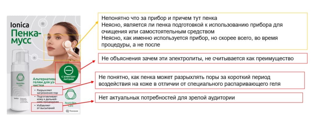
Marketplaces/Product page audit
Listings are reviewed by experienced researchers who have studied hundreds of products and the behaviour of marketplace shoppers.
We already know how a user chooses a product and what they notice in the first few seconds.
We look at the listing through the buyer's eyes and assess how quickly and clearly the key information comes across.
Based on the analysis we give concrete recommendations: what to change in the banner and the carousel so that the listing reads better and matches expectations.
These changes increase engagement with the listing and lift conversion to views and add-to-cart.
- Focus on the first seconds of perception
- A check of the meaning hierarchy in the banner and the carousel
- Recommendations on structure and wording
Case
The listing looks attractive, but the buyer critically needs to know when to take the next tablet and how fast the medicine works.
Until that answer appears on the first screens, the user cannot decide and moves on.
- Critical information belongs in the first 2–3 slides.
- Secondary facts (composition, country of origin and so on) move further down the structure.

Swipe the image left or right to see the details.